|
Comments
> A Perfect Blend Of Title Sequences? by
Gareth
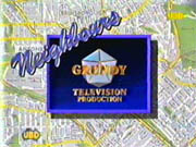
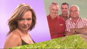
Neighbours’ opening title sequences are an institutional part of the show. There isn’t a person who watched the show in the 1980’s who doesn’t recall the familiar map title sequences, which were, at the time, an iconic part of Neighbours. However, as the show has moved into the 21st Century, opinions on the opening title sequences have been divided, and fans are left wondering how far removed their ideas of a perfect title sequence are from the makers. Here we take a look at the various opening title sequences throughout the years and ask if the makers will find a perfect blend of title sequence in the next few years?

1985
The original title sequences for the show featured the main characters in shots from the first few episodes. These are, surprisingly, quite an appropriate set of titles which convey to the audience what it is they should expect; from the aerial view of Ramsay Street; Jim and Helen chatting in the kitchen at home; Max looking over his garden gate; Paul arriving home dressed as a baby; and Shane kissing Daphne, they show what life in Ramsay Street is like. It is a shame that these titles are not so fondly remembered as some of its replacements, as they seem to offer an accurate portrayal of the show within those few shots.
1986-1990
 |
The classic titles! The fondly remembered map titles, which opened with the Robinson family playing cricket in Ramsay Street together and later closed with a classic shot of all the characters having a pool party, these are the longest-running, and, to my mind, the best of all the titles throughout the years. The original version epitomised what life in Ramsay Street was like and seemed to offer an accurate portrayal of the characters and their personalities; the close-knit Robinson family were playing cricket in the street together; Max Ramsay was furious when the cricket ball went through his window; quirky Daphne sprayed sometimes uptight Des with the garden hose. The family ethic was really shown through, and there was barely a semi-nude teenager in sight!
When the titles were updated in 1988 to include all new shots, the majority of the characters were seen around the pool, demonstrating how neighbours really could ‘become good friends’, as Barry Crocker famously sung in the theme tune. The theme and the titles really seemed to accompany each other, and it didn’t seem as if two different parties had just melded the two together, not caring whether they looked or sounded right together.
Another refreshing thing about these titles is that characters often took months until they first appeared, rather than appearing within weeks of their first appearances, though a downside to this was that characters were often still appearing six months after their last appearance!
I am, and always have been, a major fan of these titles, and long for the time when there will be a return to this style, though I sincerely doubt this will happen; I suspect the makers would feel that these titles are rather dated now. However, I will always hold a little hope and think that the likes of the Hoyland’s, the Timminses and the Scully’s wouldn’t look too bad in this style!
1990-1992
Can we really call these titles? What a major let-down after the classic titles that preceded them. Barely even a minute long, these titles retained the map style – and that was it! There were no shots of the characters, no recognisable theme tune, nothing to lure the audience in and show them what Neighbours was all about… Probably the lowest-rating titles in any list… ever! Anyhow, the makers must have thought they were doing something right with these (or maybe they were just being lazy?) as they stayed for two years.
1992-1994
 |
Dragging the show up to date and into the 90’s, these opening titles once again attempted to put across the ‘family’ feel, with numero uno family the Robinson’s shown first once again, having a garden party, and every subsequent shot featuring characters in their respective groups.
To be fair, these titles probably deserve to be remembered as much as the map-style titles do; they showed the characters in everyday situations and showed any new audience what it was that the show was about – everyday suburban show – as well as introducing them to the familiar faces they would meet. Although not as clever as its predecessor by showing aspects of the characters’ personalities in the shots, throughout the three years these titles were on screen, they managed to emulate successful sections of the 1980s titles, such as the cricket sequence, which once again featured the numero uno family, the Robinson/Martins.
Writing this article, I wonder if these titles are overshadowed by the 1980s titles, and by the future incarnations, as there is nothing bad about them, and I’m sure they wouldn’t even look that dated when viewed nowadays. They summed up the show nicely and were simple. Enough said.
1994-1995
There is very little to differentiate between the titles of 1992-1994, and these titles, except from the fact that the Neighbours logo was shown in red, rather than gold. However, these longer opening titles appeal more to me as a viewer; they feature split screen shots, a forerunner for what would appear in just under ten years’ time, they seem less rushed and show the characters at a more leisurely pace. Being longer, they are more enjoyable to watch, although once again there is very little spectacular about them. They are, simply, good viewing.
1996
A complete redesign with a purple, blue and green theme, these are once again longer titles, but offer us a ‘tour’ of Ramsay Street as Billy Kennedy goes on his paper round. The characters are seen in various activities throughout the street, all in the same location. These appeal to me greatly, as they are reminiscent of the 1980s titles when you could really believe that all the neighbours were there at the same time, whether they be playing cricket, or in this case, fixing a car, sitting on the lawn or playing croquet in the garden. These are what Neighbours opening titles should be about! Even better is the harking back to the 1980s with the pool scene at the end of the titles.
Although the 1996 season wasn’t a very popular one, I do feel that it had some of the strongest titles shown in the late 1990s, although perhaps they were changed with a bit too much frequency; the makers obviously had too much time on their hands!
1997-1998
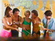 |
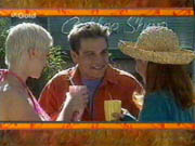
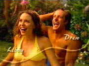
I know these titles are popular with many viewers due to the placing of the characters in their respective house groups, with house number and character names shown for the first time, and, at first, I did feel these were a good set of titles. Along with the shots of the characters with their names and house numbers were shots of them performing everyday activities; Philip spraying Helen Debbie and Hannah with the hose; the Kennedy’s dropping what looks like a piano in the street.
However, these titles had their problems; while the previous set of titles were changed with much frequency, and at first, these were changed accurately too, by late 1998 when Amy, Drew, Joel and Paul were added to the titles, they were all placed into the No.30 slot with Sarah, despite Sarah and Joel being the only characters who lived there! Why the makers could not have placed Drew with Lou and Louise and Paul with Harold and Madge is beyond me, as well as creating new shots for the merged Martin-Wilkinson family and the Kennedy family (Toadie having moved over to No.30 by now). Instead of being clever and showing the viewers who the characters were and where they lived, by this point they were only serving to confuse viewers! Alas, although these titles are popular with other viewers, they are not my favourite choice; everything seems a little too boxed and grouped, rather than looking spontaneous like the street scenes, although this was only the beginning…
1999-2000
Ugh! Showing the characters with computer generated backgrounds in either solo or couple shots was not a good idea. There is no feeling of Ramsay Street, of family, of fun and unity. The makers may have been trying to be clever and inventive, and no-one can blame them for that, but the backgrounds just looked awful, and the characters smiling to the camera was more reminiscent of an American sitcom or something like that, rather than a prime-time Australian soap opera. I’m surprised that these titles lasted for as long as they did, and would be especially surprised if they rated highly with fans. I, for one, didn’t like them one little bit!
2000-2001/2002
This is more like it! Featuring the characters in various positions around the pool, these hark back to the opening titles of 1996, when it felt like all the characters were together at the same time, having some sort of pool party or celebration. The only note of annoyance was the random pairing of characters; Michelle and Joel for instance, and, later, Matt and Harold, and the fact that none of the scenes feature Ramsay Street. However, this is a minor nitpick; there was humour, a show of neighbourly affection, neighbours coming together and being ‘good friends’. Looking back now, I view these opening titles with affection, and hope that other fans do the same.
Indeed, these title sequences were so successful that it was these to which the makers reverted to in late 2002 after the failure of the titles which they chose to open that season…
2002
Once again I must say Ugh! And this time I definitely make no apology. Featuring the characters in random group shots, with floating video clips of the characters taken from the show next to them. These are, to me, without a doubt, the worst opening titles shown in Neighbours. They show nothing to a new audience about the show, the characters and their history, it just seems lazy and ill-concieved. I’m extremely glad these didn’t last beyond a few months.
2003
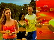
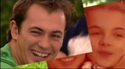
A refreshing new look for the opening titles which made use of a split screen style, taking the titles into a new direction. While the characters were seen in various familiar locations, the split screen made use of familiar sights such as cricket stumps and the sprinkler, as well as showing features of the character. These titles were excellent. They were modern, took the opening titles into a new direction and harked back to previous eras, giving us a real feel that these characters were neighbours, and also managed to put across a family feel. Over the past few years, these have been my favourite opening titles.
2004
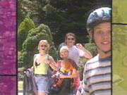
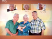
The split screen style was updated so that it overlapped more, seeming like photos in a pile that had been scattered, and this style worked very well for the titles, as it is like we are seeing brief clips of the characters lives. The groupings of characters also allowed us to see families together, as well as harking back to previous eras; the effect was that of the characters out in the street at the same time in some places, and we were shown familiar sights, such as the Hoyland family around cricket stumps, and Harold, Lou and Izzy round the barbecue. Once again, these titles have rated highly with the writer.
2005
Another brand new look for the opening titles, and this time with colourful computer generated backgrounds, mixed with backgrounds of familiar locations and sights, and a continuation of the overlapping style which frequented last season’s titles. This provoked controversy and mixed reactions from the fans, as some thought that the makers were trying to emulate the opening titles of rival soap Home and Away, and there were feelings that older, more established characters were seen only once, while other, less familiar faces were shown on several occasions. I did like these titles, but didn’t see why characters such as Sky and Boyd were shown three times within the titles (we really do understand who they are once we have seen them twice) while more established characters such as Lyn and Susan have only fleeting appearances. In addition to this, there was no location filming, only computer generated backgrounds, which soured what could have been good opening title sequences.
2006
A brand new look debuted with the start of the season, and for the first time since 2003 there was no split-screen style, but a ‘drifting’ style as the camera drifts past the characters and is continuously moving. Computer generated backgrounds were again used, but this time to reflect familiar backgrounds, such as Ramsay Street, the General Store, and the character’s homes.
Again, there was no location filming, no feeling of family, of unity, of spontaneity or of fun, and once again there were too many appearances of some characters (Janae, Boyd, Dylan, Sky) and not enough appearances of others (Susan, Lyn) who were more established.
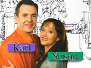
It seems that to create the ‘perfect blend’ of opening title sequences, this writer requires several things; an overall family feel for the titles; a sense of unity, like a cricket match, or a party around the pool; there needs to be spontaneity, like we are viewing a day in the life of Ramsay Street, and characters need only appear once in the opening titles – not several times. Here’s hoping the makers of the next opening titles take note: no more computers! Just the characters and Ramsay Street, and we’ll be happy.
To see more of the opening title sequences, visit the Opening Titles Gallery.
Back
|