|
.
Interviews
> D MAX Design
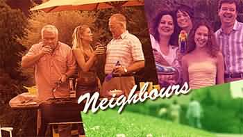
At the beginning of 2003, Neighbours launched with a brand new titles sequence utilising a split screen device, and largely received the approval of fans, who welcomed a return to a more traditional style opening. However, much to our surprise, 2004 launched another new titles design, albeit utilising some of the footage from the previous year’s sequence in a new format. Neighbours’ Executive Producer, Ric Pellizzeri, stated that the reason for changing the format so soon was that “there were a number of things that didn't work for the 2003 titles”. D MAX Design was the company commissioned to create the new sequence for 2004, and here Chris Hughes, the man at the top, discusses the company and his work on Neighbours.
I have been working as a graphic designer for ten to twelve years. Presently, I work from a home studio and use a range of suppliers, such as web programmers, where necessary. About four or five years ago I operated D MAX as a studio with five or six employees but then made the decision to manage a smaller range of projects by myself. At that time, I was also doing a fair amount of illustration work, which is obviously difficult to delegate to employees.
I have had an unusual career path in that I originally qualified as a doctor and worked as a general practitioner, for about eight to ten years, although most of that was part-time while I undertook graphic design studies and built up my design business. Because of this a reasonable amount of my business is in the medical and biotech fields. I work on a variety of projects for several large medical research institutes, including The Walter and Eliza Hall Institute of Medical Research.
|
|
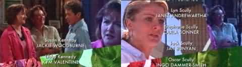
| D
MAX instructed Neighbours on how to insert their own new
footage as required to update the titles, as can be seen
here when the character, Joe, left the programme and a
new scene was inserted. |
When I started D MAX, I was mainly producing print based graphics such as brochures and annual reports, exhibition work and signage. But over the last five years I have made a conscious effort to move into new areas of design such as multimedia, website design, 3D illustration and animation, video and television. People can view a range of my current projects, both print and new media, by going to the D MAX website.
My design work is all about problem solving in a visually creative way.
With regard to the current Neighbours titles, the brief I was given was to produce something that was different from what had been done before, that was sympathetic to content of the show and showed as much of the cast as possible. After all, the titles are only 22 seconds long, which is not very much time at all to present all the characters. As quite a lot of footage of the cast had just been shot for the opening titles I was also asked to design something that would make use this existing material, if at all possible.
 |
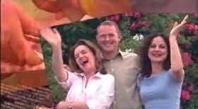
After I had examined all the previous title sequences over the last five to ten years I decided that a good way to present all the cast members in the time available was to use some sort of interesting split screen device. This would follow on the from the previous titles simple use of a split screen. I decided to angle the split screen to make it more dynamic and allow corners to move across the screen in different directions. By bringing different screens in from different angles a jigsaw puzzle montage of the characters is created. The way that the screens mix is a metaphor for the way that the characters interact during the show. To make all the difference screens work together, aesthetically, I decided to colorize the fade out of each of them so that you get a wash of colour over the screen underneath. I think that this effect works particular well. The angling of the screens also helped with placement of the Neighbours logo at the end of the sequence. The way that the screens move and fade out gradually matches the pace of the theme song.
Global Television (the company who own the Melbourne studio complex where Neighbours is filmed) was responsible for modifying the titles and they produced the end credits based on my design.
|
|
| D
MAX had no direct involvement with the creation of a matching
closing sequence, but Neighbours wisely adopted the same
style as the opening. Utilising the layout seen during
the final frames of the titles enables up to four episode
stills to be displayed and rotated through a cross-fade
filter. |
I
believe that these titles fulfil the brief I was given in
a simple and elegant way. However, it is only one of a number
of different approaches and I’m sure that if I was given another
opportunity to design the titles they would look quite different
from the way they do now. Exactly how they would look would
depend on the new brief I was given.
As to the future for D MAX, I would like to do more television and animation work. I would enjoy working on some interesting titles for a film. Currently, I’m writing a children’s novel and working on an associated picture book along with everything else.
In 2005, Neighbours yet again began the year with a new set of opening titles, yet for the first time in many years, the new version stuck with the same stylistic formula as the previous year’s – the only modification being new footage. This new sequence has the benefit of utilising film made especially for this style of sequence, as opposed to the second-hand footage that D MAX had to work with. Other changes made are that many of the overlaid sequences now show the characters against block-colour backgrounds, presumably to save time and money by filming in-studio and that the colour-wash over the cut-out boxes no longer appears. The closing sequence remains unchanged, however, despite the lack of colour-tinting in the new opening.
Interview
by Rhys. Added on 29th January 2005
Back
|