|
.
Interviews
> Ryan Renshaw
The
Neighbours opening titles have undergone many changes
over the years, and in 2000 Ryan Renshaw was commissioned
to design a new sequence to accompany the show's move to widescreen
production. He describes the creative process from concept
to finished montage, complete with his original storyboards
and plans.
Can
you give us some background
on your work outside of Neighbours?
My background is in working for as an on-air promo director
for MTV Australia, MTV Latin America and Network Ten, and
also as a director of music videos. When I was asked to create
the titles I was working as a freelance promo director.
How
did you get the job on the show?
I was purely a contractor brought in to do the titles as a
one-off. It is a relatively unusual situation in that, because
of contractual agreement, it is the only part of the programme
that is not made by Grundy, but rather Network Ten in Australia.
Neighbours is of course somewhat of an institution
and so the prospect of creating the titles was an exciting
thought!
What
guidelines were you given for the new sequence?
The titles were a fixed duration - 22 seconds - and within
this time frame, of course, one must establish each character
that features in the show, preferably in a way that summarises
their personality. The next challenge is that, because the
characters in Neighbours are constantly changing and
evolving through the season, the sequence must then be created
in a way that allows it to be easily manipulated. If the producers
know that Flick is going to be leaving, then the character
she is shot with should also be shot as a single to be placed
into the cut when this eventuates.
Did
you research any past sequences?
I was very familiar with many of the previous sequences simply
due to growing up with Neighbours as a kid. To be honest,
the initial request to make the sequence excited me because
I saw it as a chance to re-invent - to an extent - the very
predictable sequences we have seen in the past. The budget
allowed us to shoot in an interesting way and in locations
that might not be what I saw as 'predictable' as the previous
sequences. So in the first presentation to Grundy and Network
Ten, I explained about five very diverse ideas. From the perspective
of Grundy there was the same inherent problem in all of these
ideas. With Grundy continually updating the titles, they
needed a location they could access easily, and the titles
needed to be shot on video - not film as many other 'non-soap'
opening titles are. These were the frustrating challenges
that ultimately took us back to the familiar scene of seeing
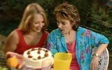
the cast having a great time in the backyard of a home in
Ramsay Street.
|
|
What
was your overall concept for the credits - were there any
elements the producers vetoed?
Once the basic framework of the title concept was set, my
principle goal was in developing a way to stylise the imagery
in a unique way that could be easily mimicked down the track
by the Grundy crew when they were ready to update. The other
element I pushed strongly was shooting elements of underwater
photography to be fleetingly intercut through the sequence.
We shot two of the girls under water, Holly Valance and Krista
Vendy. In the end, disappointingly, the footage was excluded
from the final cut.
You
oversaw the first widescreen titles - did this present any
particular concerns?
Widescreen will one day be wonderful. For the time being,
however, widescreen is a pain in the ass. Certainly - like
everything that is shot for a 16:9 finish - one frames for
4:3, but makes absolutely sure that the 16:9 space also works
effectively as a frame. So all characters would sit within
the 4:3 frame leaving empty space on the left and right, for
the handful of people at home with widescreen televisions.
I remember presenting the idea early on of creating effective
4:3 titles, but with graphic elements on the left and right
of frame. The graphics were then a kind of 'bonus' for those
with a widescreen televison, but not essential if your were
only watching on a traditional telly.
How
was the sequence planned and recorded?
Initially I flew to Melbourne and viewed the location. Walking
up Ramsay Street for the first time is a very surreal experience!
Each sequence and the combination of characters appearing
in that image was, of course, planned well in advance. For
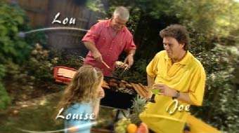
example we filmed Lou, Louise and Joe standing at the Barbeque,
but I was also asked to only film Lou and Louise separately
too. Perhaps the producers knew something I didn't! There
were ten set-ups overall in the backyard and then also the
underwater scenes with Tess and Felicity that never made the
final cut. For those who may care, the titles were shot on
Digital Betacam, primarily on a remote-head crane fitted with
a third axis. The third axis allows the camera to rotate and
spin as well as pan and tilt - and you'll notice this as a
recurring technique used throughout
What
were the recording conditions like?
my memory of the day was perfect blue skies. It was super
hot, high 30s - Celsius! Perhaps it clouded over in the afternoon.
|
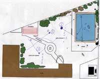
A location plan used during preparation
for the shoot
|
What
were the cast like? Did you have specific set-ups planned,
or were they improvised?
The cast were... varied. Most were wonderful, some were painful...
but it was a hot day. I would be lying if I said it was one
of my easier shoot days. Almost everything was highly planned.
Only with the underwater sequences, at the end of the day,
did we experiment a little more.
We
also shot the image of the Ramsay Street sign which features
as the end frame, with the superimposed Neighbours
logo. This was another little surreal moment in life - carrying
the Ramsay Street sign to the location in a station wagon
and wondering how much we might get for it if we diverted
to a pawnbroker! Ramsay Street, of course, isn't called Ramsay
Street in real life, but it is absolutely unmistakeable when
you walk into it. Apparently there are bus tours to there
daily. We did meet briefly some people who actually live in
one of the houses. What a very strange existence that must
be for them.
What
post production work was done after recording?
The post production process really was very simple. An offline
edit is created, reviewed, tweaked, critiqued and tweaked
again. Then it goes into the online process where the graphics
are added. This was the first time that the Neighbours
logo stepped up to a full three-dimensional rendered version
from the standard flat cursive writing.
What
was the inspiration for the graphic "ribbons" added
to the final shots?
If I remember rightly, my suggestion was that they were going
to ripple - in the same way as water. I think this idea was
eliminated when the underwater sequences didn't make the final
cut.
Were
you involved in any of the updates on the titles?
I was not involved in any of the updates. In fact six or so
months after they'd had been running I wondered why my name
was still being credited at the end when so little of the
original titles remained.
Were
you told why your designs not used for the show's relaunch
in 2002?
No. I've had no contact with Grundy since the first titles
were sent out to air.
Looking
back, what elements of the final sequence were you most and
least satisfied with?
I was happy with how the third axis on the crane worked and
how the images melded well through the continuous moves. However,
this also became what I was least happy with when Grundy began
updating the titles with new character images, without the
use of a crane or third axis - so any additional images to
the original sequence really tended to stand out.
Finally,
do you remember any interesting incidents while working on
the show?
Errr... Nothing that wont land me in a court room!
 . .
. . 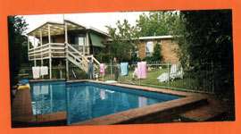
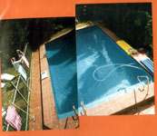
Ryan's
original location recce photographs of Number 30's pool and
backyard
Multimedia:
2000 Opening
Titles Presented in full 16:9 widescreen. Realvideo
1240k

Storyboard
to Shot Comparison
|
|
Lou
Carpenter (Tom Oliver), Louise Carpenter
(Jiordan Anna Tolli) and Joe Scully (Shane Connor)
|
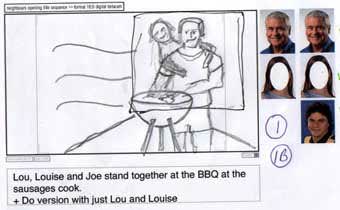 |
The
wavy parallel lines seen to the edge of the storyboard
images indicate the original water-motif graphic "waves",
which were simplified to the animated ribbons seen on
the final design.
Two
versions of this shot were recorded; the version seen
in the final sequence, and an alternative, featuring
just Lou and Louise.
|

|
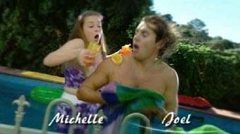
|
Michelle
Scully (Kate Keltie) and Joel Samuels (Daniel
MacPherson)
|
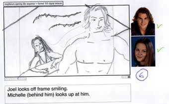 |
The
original storyboard instead features Joel looking on,
while Michelle leans on the pool edge watching him.
|

|
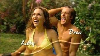
|
Libby
Kennedy (Kym Valentine) and Drew Kirk (Dan
Paris)
|
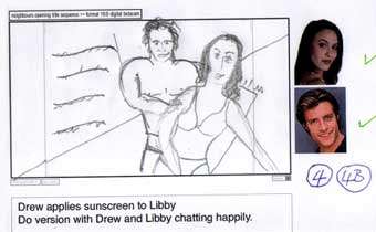 |
Two
versions of this shot were storyboarded: One features
Drew rubbing sunblock on Libby's back; the second features
the couple chatting.
|

|
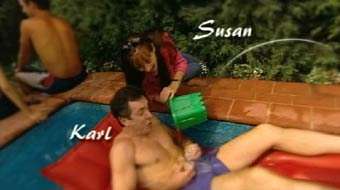
|
Karl
Kennedy (Alan Fletcher) and Susan Kennedy
(Jackie Woodburne)
|

|
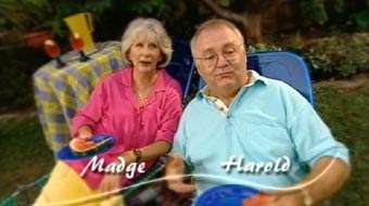
|
Madge
Bishop (Anne Charleston) and Harold Bishop
(Ian Smith)
|
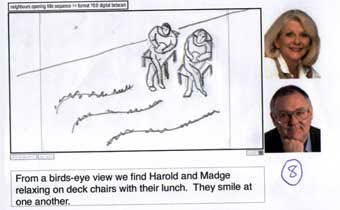 |
This
shot was originally planned as a bird's eye view, shot
from the back patio of the property, seen in the location
photographs above.
|

|
|
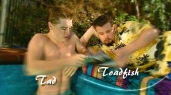
Tad
Reeves(Jonathon Dutton) and Toadfish Rebecchi
(Ryan Moloney)
|
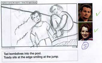 |
This
shot originally featured Tad dive-bombing into the pool,
with Toadfish watching at the edge.
|

|
|
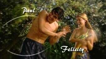
Paul
McClain (Jansen Spencer) and Felicity Scully
(Holly Valance)
|
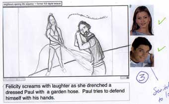 |
Paul
was originally meant to be wearing a shirt in this shot.
|

|
|
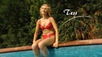
Teresa
Bell (Krista Vendy)
|
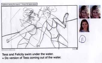 |
This
shot, featuring Tess getting out of the pool was recorded
to dovetail from the unused underwater sequences featuring
Tess and Felicity.
|

|
|
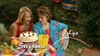
Stephanie
Scully (Carla Bonner) and Lyn Scully (Janet
Andrewartha)
|
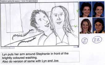 |
The
original plan for this shot features Lyn hugging Stephanie,
against a background of brightly-coloured washing hanging
on a line.
Two
versions of this shot were recorded; the version seen
in the final sequence, and an alternative, which replaced
Stephanie with Joe Scully.
|

|
|
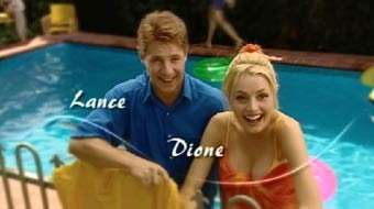
Lance
Wilkinson (Andrew Bibby) and Dione Bliss
(Madeleine West)
|
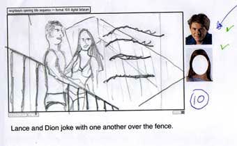 |
The
original sketch for this scene features Lance and Dione
in bathing costumes.
An
additional, unused version of this shot was also recorded,
featuring only Dione. Ironically, when the titles were
updated following Andrew Bibby's departure, an entirely
new shot of Dione was recorded.
|

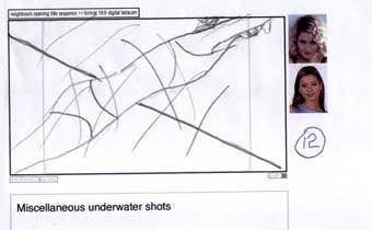 |
A
selection of abstract underwater images of Felicity
and Tess were also recorded, to be intercut fleetingly
throughout the sequence. None were featured in the broadcast
version.
|
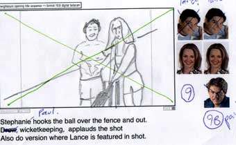 |
A
plan for an unrecorded shot featuring Stephanie and
Paul playing cricket. A second variant was planned,
also featuring Lance.
|
Images
courtesy of Ryan Renshaw and Urban Guerilla Films (Sydney)
Interview
by Stuart. Added on 1st April 2003
Back
|

